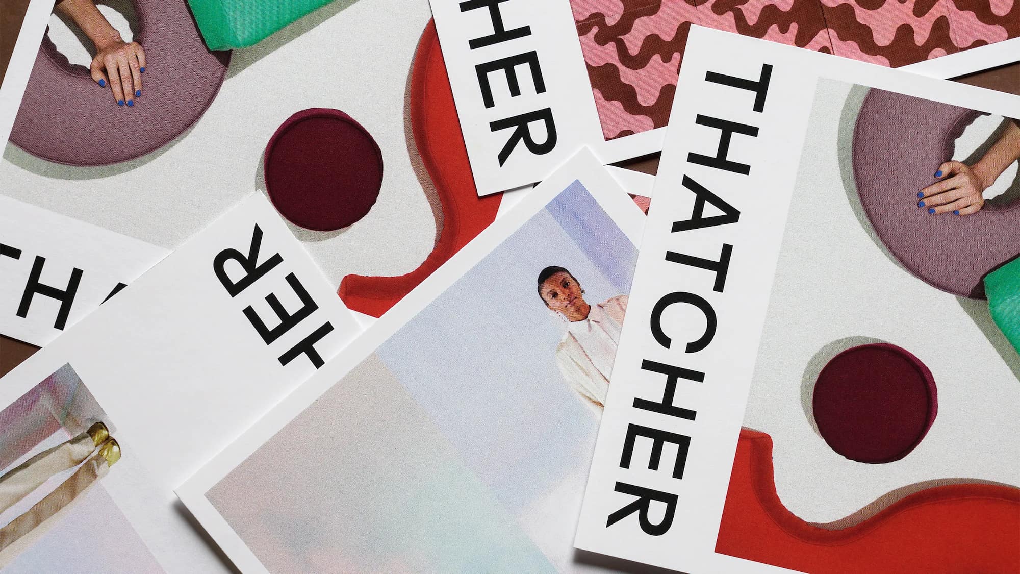
Thatcher is a Portland-based design studio offering a range of hand-crafted wall coverings, tile, and home goods with a distinct creative perspective and a focus on sustainability.
Thatcher's design approach lives at a crossroads of fine art and imperfection. Guided by conceptual thinking and consideration of details, the company celebrates the unexpected beauty of opposites, reveling in the juxtaposition of elegance and chaos.
At a pivotal point in the brand's growth, Thatcher approached us to reimagine their name and redesign their brand, which at the time, was named JuJu Papers. Marking this critical step, we developed a new identity that balances their hard-working roots with their vision for an elevated and highly-curated line of products.
We worked closely with the Thatcher team to find a name that would be lasting and confident, and we all agreed to build the identity around their creative founder—Avery Thatcher—whose spirit permeates every aspect of the business.
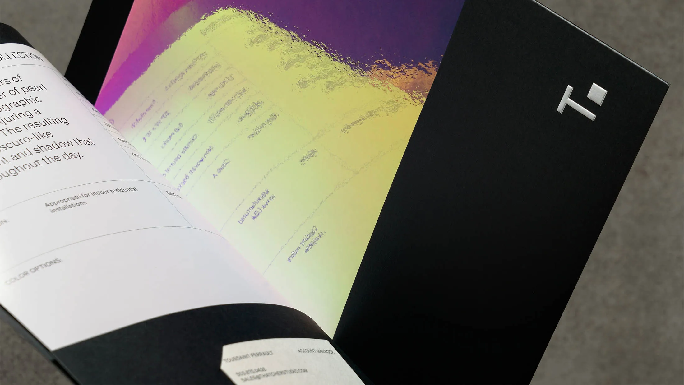
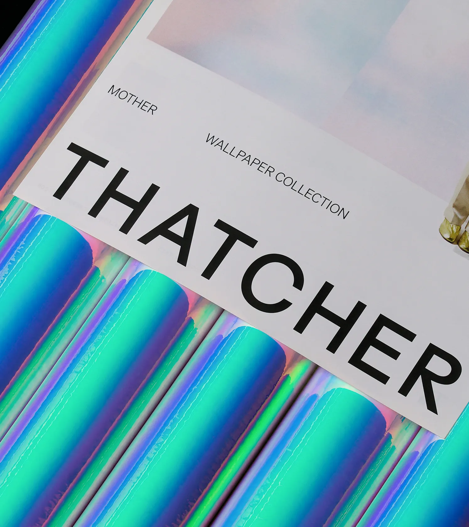
In designing the visual system, we focused on the products, ensuring their beauty and essence remain at the center of the brand. The paired-down brand marks reflect this open and complementary exchange, creating a flexible and supportive design language that expands across printed and digital expressions.
We are honored to work with Avery Thatcher and their creative team to craft an identity and visual system that will grow with them as they expand into the future.

Thatcher is a Portland-based design studio offering a range of hand-crafted wall coverings, tile, and home goods with a distinct creative perspective and a focus on sustainability.
Thatcher's design approach lives at a crossroads of fine art and imperfection. Guided by conceptual thinking and consideration of details, the company celebrates the unexpected beauty of opposites, reveling in the juxtaposition of elegance and chaos.
At a pivotal point in the brand's growth, Thatcher approached us to reimagine their name and redesign their brand, which at the time, was named JuJu Papers. Marking this critical step, we developed a new identity that balances their hard-working roots with their vision for an elevated and highly-curated line of products.
We worked closely with the Thatcher team to find a name that would be lasting and confident, and we all agreed to build the identity around their creative founder—Avery Thatcher—whose spirit permeates every aspect of the business.
In designing the visual system, we focused on the products, ensuring their beauty and essence remain at the center of the brand. The paired-down brand marks reflect this open and complementary exchange, creating a flexible and supportive design language that expands across printed and digital expressions.
We are honored to work with Avery Thatcher and their creative team to craft an identity and visual system that will grow with them as they expand into the future.