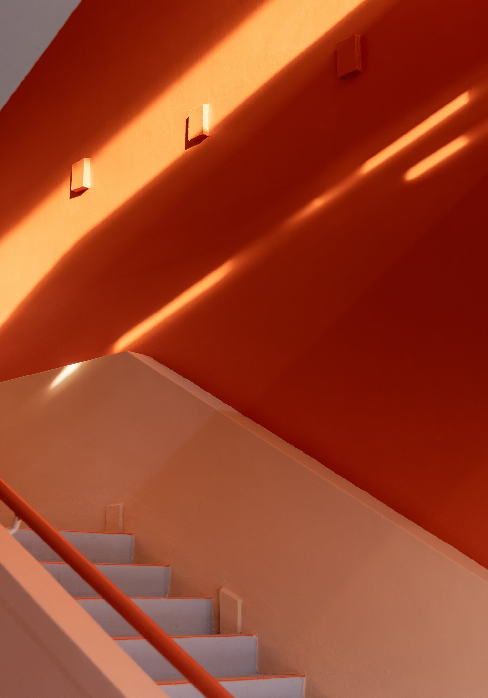
New Bahru is a vibrant destination that seamlessly blends everyday comforts with creative expression. The centerpiece of River Valley, Singapore, it offers one-of-a-kind retail, dining, and entertainment experiences on the site of a former state high school.
After an incredible kick-off trip to Singapore to visit the site, immerse in the culture, and conduct research—we worked closely with the amazing client team at Lo & Behold to create a dynamic branding system for the whole space that could act as a container for the myriad creative businesses the site will come to hold. The challenge was in creating an identity that could be bold enough to be engaging while also being able to retreat when needed to allow for the expressive nature of the brands it will house. We were fortunate enough to collaborate with the local Singaporean architect firm FARM and the talented landscape designers from Humid House as they iterated on their designs for the master plan, which allowed us to think about the wayfinding system in great detail.
The name is a playful use of blending two different languages (English and Malay) which reflects the hybrid nature of the project and its aim to bring together diverse communities. It celebrates the multiculturalism that contributes to the vibrancy of Singapore, and the code-switching fluency of the Singaporean people while also conveying the goal of creating a space that is constantly evolving and adapting to new (new) ideas and perspectives. To continue that thread of code-switching we created a custom hand font with a bit of cheeky character to balance the more utilitarian and modern, Favorit. The character of our marks are derived from the overall shape of the structures from above, as well as the distinctive arc shapes in the original hall building.
Utilitarian, yet bold and charming, our concept reflects the creative spirit embedded in the development. Using our “N” from the primary mark as a foundational structure for signage ties our design to the architecture of the building through the lens of the identity. The use of color adds a vibrant energy helping people navigate the space, while layering conceptual nods to the blending of experiences and cultures. The result is a flexible system that feels connected, dynamic, and memorable! New Bahru is an ever-evolving destination for those with a curious mind. Stop by next time you’re in the South Seas ;)
Now Open!
%20-%20digital.jpg)


